Description
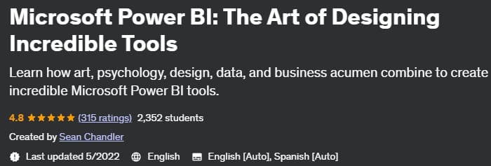
Microsoft Power BI: The Art of Designing Incredible Tools, the training course on designing incredible tools with Power BI has been published by Udemy Academy. This course focuses on the concept of designing beautiful reports and dashboards. Are you a Power BI developer struggling with how to design tools that look as amazing on the front end as they do on the back end? You have chosen the right course. Where other great courses teach the technical aspects of Power BI that help aspiring BI engineers collect data, transform it, visualize it, and deploy tools throughout their enterprise, This course specifically focuses on the art of designing tools that look amazing, tell data stories, and deliver a great online user experience.
In this course, you will learn some basic design techniques based on Gestalt psychology. You will learn how to use color to create the most important information. You’ll learn how data storytelling is very different from traditional storytelling and learn about the many things that BI tools and video games have in common in terms of user experience. In 15 hours, we don’t guarantee you’ll learn everything you need to know about data design and storytelling. But you’ll gain the knowledge to upgrade your BI tools from a collection of data visualizations to beautiful tools that use data visualization, design, color, text, images, and other elements to invite your users into your creations.
What you will learn
- Learn the basics of gadget design. You will learn smart design techniques in business intelligence reports and also avoid common mistakes.
- You’ll learn how to use color strategically in your tools to ensure maximum readability and guide your users to the most important points in your tools.
- Interpret datasets to create compelling narratives that drive business users to information and ultimately action.
- Use common business tools and built-in Power BI functionality to engineer design and navigation experiences for your users that make them crave your tools.
Who is this course suitable for?
- This course specifically focuses on Power BI users who are skilled at creating data visualizations such as bar graphs, line charts, etc., and have little difficulty modeling their data, but struggle with designing attractive and user-friendly reports. This course focuses on teaching useful design principles, basic web navigation features, and data storytelling. Beginners to Power BI should find many of the design techniques in this course more or less comprehensive, but this course will examine BI tool design exclusively from a Power BI perspective.
Course details Microsoft Power BI: The Art of Designing Incredible Tools
- Publisher: Udemy
- teacher : Sean Chandler
- English language
- Education level: introductory
- Number of courses: 28
- Training duration: 14 hours and 44 minutes
Chapters of the Microsoft Power BI: The Art of Designing Incredible Tools course
Course prerequisites
- Basic data visualization experience is a requirement for this tool and familiarity with data modeling concepts will be extremely helpful. No DAX or Power Query experience is required for this course.
Pictures

Sample video
Installation guide
After Extract, view with your favorite Player.
English subtitle
Quality: 720p
download link
File(s) password: www.downloadly.ir
Size
8.43 GB
Be the first to comment